
Showing posts with label Focous Group. Show all posts
Showing posts with label Focous Group. Show all posts
Wednesday, April 2, 2014
Monday, March 31, 2014
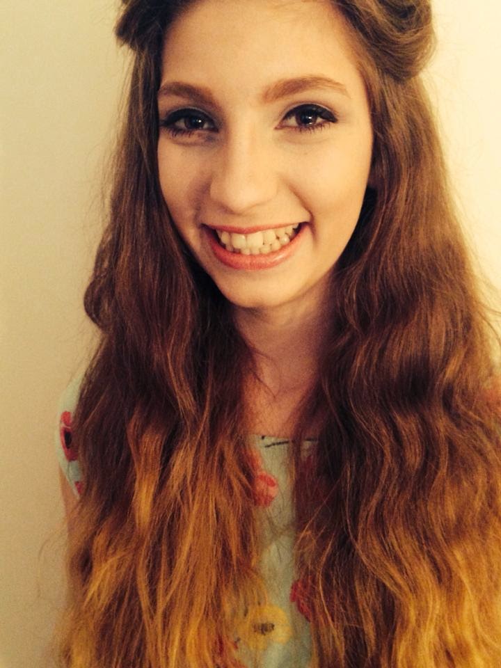
Final Production - Front cover image
Final Front Cover Image
Do you think that the front cover image would be better in normal colour or black and white?
85% Black and white
15% Normal colour

Do you think that the front cover image would be better in normal colour or black and white?
85% Black and white
15% Normal colour
Thursday, March 13, 2014
My magazine logo
After my research on logos I decided to create one for my magazine. I created a simple logo, easy to recognise for my young audience.
I asked my focus group which colour scheme will be more suitable according to them for my magazine.
I created this logo in publisher by using simple shapes and just the initial letter of my masthead. I tried to use a variety of combination of colours to give my focus group a greater choice option.
About 80% of my focus group preferred the white and black theme to be present in the logo too and they thought that the black and blue wouldn't go well with my cover image.
Wednesday, March 12, 2014
Layout + Colour scheme....
After proposing the two possible images for my front cover some members of my focus group (Lucy, tom, Louise and Robbie) noticed that the previous proposed layout and colour scheme wouldn't look homogeneous with the black and white theme.
So i decided to put forward a set of question to the my focus group to understand their view about it...
ACCORDING TO THESE TWO POSSIBLE FRONT COVERS....


- Do you think that the blue/black/white colour scheme should still be used?
Yes 80%
No 20%
-Do you think that the banner at the top of the magazine would still look appropriate?
Yes 15%
No 85%
- Do you think the font should be changed or stay the same?
Change 70%
Stay the same 30%
So i decided to put forward a set of question to the my focus group to understand their view about it...
ACCORDING TO THESE TWO POSSIBLE FRONT COVERS....
- Do you think that the blue/black/white colour scheme should still be used?
Yes 80%
No 20%
-Do you think that the banner at the top of the magazine would still look appropriate?
Yes 15%
No 85%
- Do you think the font should be changed or stay the same?
Change 70%
Stay the same 30%
Tuesday, March 11, 2014
Choosing The front Cover Image......
Possible Final Front cover
Focus Group

 I wanted my front Cover image to be in black and white as my research has shown that the majority of magazines covers are in colour so I wanted to go against conventions and make mine in black and white to make it stand out from the rest and make it look unique. I also chose spontaneously to avoid the use of direct mode of address by my model to create a more mysterious effect and intrigue the reader, this is also due to my research showing that commonly covers tend to use direct mode of address to create a bond with the reader.
I asked my focus group which two pictures they preferred the most, and this is what they replied.
Focus Group
I wanted my front Cover image to be in black and white as my research has shown that the majority of magazines covers are in colour so I wanted to go against conventions and make mine in black and white to make it stand out from the rest and make it look unique. I also chose spontaneously to avoid the use of direct mode of address by my model to create a more mysterious effect and intrigue the reader, this is also due to my research showing that commonly covers tend to use direct mode of address to create a bond with the reader.I asked my focus group which two pictures they preferred the most, and this is what they replied.
- 80% preferred the first one as they felt like i gave a more artistic effect with the use of the guitar and the background, whereas the other 20% preferred the styling of my model more in comparison to the first one.

Thursday, March 6, 2014
Pricing and Releses
I asked my focus group how often I should release the magazine and the price it should be.
The focus group excluded weekly or twice a week as it would be less interesting due to lack of articles/interviews leading to exhaustion of stories. Also this would increase consumers cost which could possibly cause a decrease in sales.
80% of the focus group voted for monthly as this follows the conventions of Q and Clash magazine.Also the magazine will contain greater volume of stories and interviews.
When to release the magazine was between either:
-Monthly
-Weekly
-Every two weeks
-Or twice a week
- Once the focus group decided on when to release the magazine this then allowed me to put toward my ideas on pricing.
A £4.00
B £3.50
C £2.50
D £1.50
Only 25% chose option A as it was the most expensive and since the demographic for my magazine are young teenagers they wont have much money. However 60% voted for option C as they retained to be the most reasonable price for young teenagers , and many thought that £1.50 would not make enough profit.
Wednesday, February 5, 2014
Magazine title and Colur scheme.....
I asked my focous goup, through email, to decide for the font, colour and style of the title of my magazine, which has been previously dicussed is going to be 'Loud.'
 These were the text option i gave my focous group.
I sked for an individual email form all of the members with their answer, so that the vote was private and they wouldnt conform to the rest of the group.
Only one person choose the number 1 option, 5 people choose the option number 2, 3 people choose number 3,and 2 choose number 4.
From this results it is clear that the majority of the teenagers in my focous group prefered the second option so is the one that I will be using for my cover.
Colour scheme....


These were the colour scheme options for the cover of my mgazine with the corrispondent masthead. The 'L' is in the colour of the box at the top of the magazine to make it look coherent.
I asked again my focous group if after seeing the mast head and the coloured banner at the top togheter if they changed their previous vote, and only one person changed their vote from the option number 1 to option number two.
I asked my focous goup, through email, to decide for the font, colour and style of the title of my magazine, which has been previously dicussed is going to be 'Loud.'
I sked for an individual email form all of the members with their answer, so that the vote was private and they wouldnt conform to the rest of the group.
Only one person choose the number 1 option, 5 people choose the option number 2, 3 people choose number 3,and 2 choose number 4.
From this results it is clear that the majority of the teenagers in my focous group prefered the second option so is the one that I will be using for my cover.
Colour scheme....
These were the colour scheme options for the cover of my mgazine with the corrispondent masthead. The 'L' is in the colour of the box at the top of the magazine to make it look coherent.
I asked again my focous group if after seeing the mast head and the coloured banner at the top togheter if they changed their previous vote, and only one person changed their vote from the option number 1 to option number two.
Tuesday, February 4, 2014
Traget Audience....
The manin target audience of the magazines that I have analysed are young adults between the age of 16-25.
However I have decided to make my target audience different due to the fact that most magazines are targeted for young adults,so my main target audiece is going to be young teenagers between the age of 12-17.
Subscribe to:
Posts (Atom)