Front page...
My magazine influence for the front cover is going to be Clash magazine as I like the unique style and that it tries to combine both mainstream and underground genres that include fashion, film and entertainment in its subject matter which therefore reflect on the front cover.
Target audience 18-25
Its target audience however Is more young adults whereas I would like to create a magazine with a similar style but with a younger demographic as I don't think is something conventionally found.
.jpg)


The main image found on Clash magazine are usually close ups of the artist face so I am going to try and do the same with my front cover. I also like the big masthead on top of the magazine wich is esily visible to the audience. The writing is minimal and in small font however due to my young emogrphic I am going to make my font bigger to allow my target audience to read it easily. They also have the name of the artist in a bigger font to make it the main emphasy of the cover. The pictures are really artistic and clearly show the 'clash' of different type of music even nieche subgroups that have a typical music and fashion style.
_________________________________________________________________
Contents page...
My inspiration magazine for the contents page is going to be Vibe magazine as i like the idea of having a single yet effective image on the contents page. I also like the way the title 'contents' is not placed in a liner way, but the syllables of the word are placed undrernith it. The writing is on either side of the page depending on the image and their logo is present behind the artist, fading into he background, they have used the initial of themagazine name which is 'vibe' so a v, i am going to use the initial of my magazine masthead which is an L. The text is minimal but informative , again the writing is smaller so I am going to my text smaller to allow my target audience to read it and understand it more easily.
___________________________________________________________________________________
Double page spread....
My inspiration for the double page spread is going to be Vibe/Q magazine as i like the layout of the page, i also like the use of one main image positioned on one page and the article filling the other page. The article is devided into two collums so i am going to do the same for my double page pread.
The typical image used for their double page spread is usually a close up of the artist face, once again they have the magazine logo at the back of the article.
.jpg)

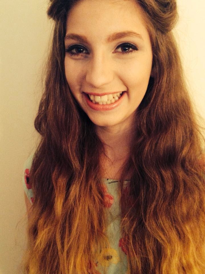


 I wanted my front Cover image to be in black and white as my research has shown that the majority of magazines covers are in colour so I wanted to go against conventions and make mine in black and white to make it stand out from the rest and make it look unique. I also chose spontaneously to avoid the use of direct mode of address by my model to create a more mysterious effect and intrigue the reader, this is also due to my research showing that commonly covers tend to use direct mode of address to create a bond with the reader.


.jpg)


