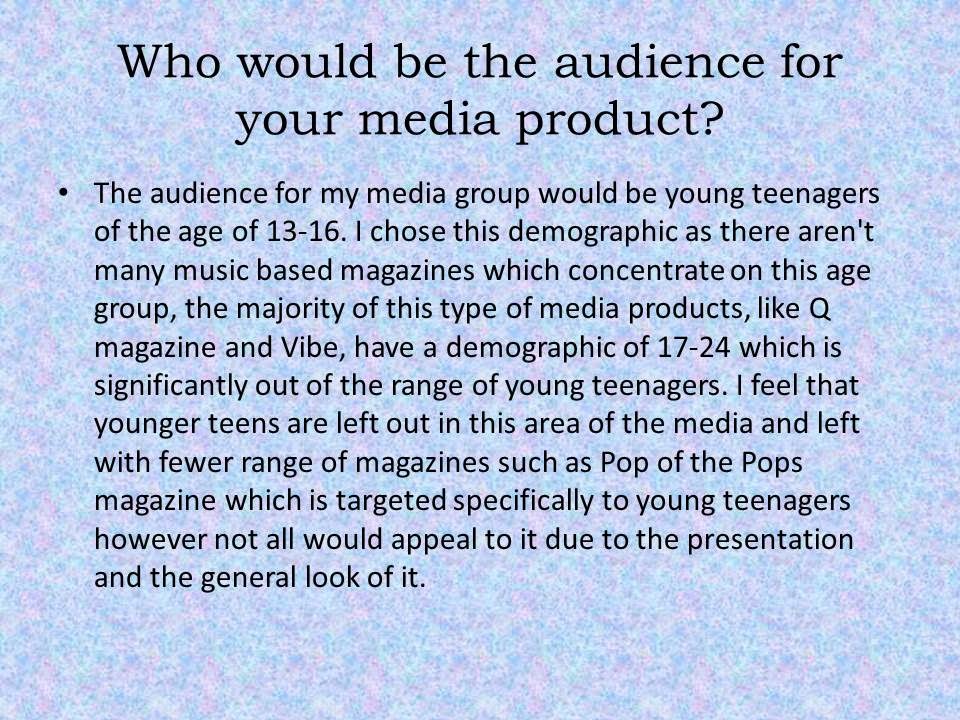
Wednesday, April 2, 2014

Here are some other photos that I took before choosing the final ones. I tried to create a variety of looks and tried different poses to make the final look of the picture more effective.


Question 6


Evaluation - Question 4+5


Monday, March 31, 2014

Final Production - Front cover image

Final Front Cover Image 

Do you think that the front cover image would be better in normal colour or black and white?

85%  Black and white
15% Normal colour


Thursday, March 27, 2014

Evaluation- Question 2


Evaluation- Question 3


Final Production Draft

 
 Final Production Draft

This is a draft for my final product, after consulting with my focus group I decided to change the image and the image type so instead of a medium close up I am going to use a close up with the model looking directly at the camera to create a bond with the reader. Moreover for my contents page I am going to use one image instead of two, as my research shows that it is conventionally found on most contents pages.

Focus group questions-


Close up or medium close up for the front cover?

80%- close up
20%- Medium close up


One image or multiple on the contents page ?

70%- single image
30%- multiple images

For the front cover I also decided to change the font an layout of the text, whereas for the contents page I am going to add more text and insert the logo (L) at the back of the text.


Thursday, March 13, 2014


My magazine logo

After my research on logos I decided to create one for my magazine. I created a simple logo, easy to recognise for my young audience.
I asked my focus group which colour scheme will be more suitable according to them for my magazine.
I created this logo in publisher by using simple shapes and just the initial letter of my masthead. I tried to use a variety of combination of colours to give my focus group a greater choice option.

About 80% of my focus group preferred the white and black theme to be present in the logo too and they thought that the black and blue wouldn't go well with my cover image.

Wednesday, March 12, 2014

Layout + Colour scheme....

After proposing the two possible images for my front cover some members of my focus group (Lucy, tom, Louise and Robbie) noticed that the previous proposed layout and colour scheme wouldn't look homogeneous with the black and white theme.
So i decided to put forward a set of question to the my focus group to understand their view about it...

ACCORDING TO THESE TWO POSSIBLE FRONT COVERS....


- Do you think that the blue/black/white colour scheme should still be used?

Yes 80%
No 20%

-Do you think that the banner at the top of the magazine would still look appropriate?

Yes 15%
No 85%

- Do you think the font should be changed or stay the same?

Change 70%
Stay the same 30%

Tuesday, March 11, 2014

Logos

In my research I also looked at what type of magazine used logos to make their magazine easily recognisable to the audience and I found that many magazines use very unique mastheads and fonts to make them appear different and unique however I found that Q magazine, Vibe magazine and NME use very specific logos which fit with the overall colour scheme of the rest of the magazine.


An example of this is Q magazine as it has a capital Q written in white, inside a red box. This logo is easily recognisable as it is composed by just one letter also the colour red is eye catching and creates a good contrast with the white. I decided to create a similar logo to Q magazine as it is very effective yet simple to do and also since my demographic are young teens it will be easy for them to simply identify this.

Choosing The front Cover Image......

Possible Final Front cover

Focus Group


 I wanted my front Cover image to be in black and white as my research has shown that the majority of magazines covers are in colour so I wanted to go against conventions and make mine in black and white to make it stand out from the rest and make it look unique. I also chose spontaneously to avoid the use of direct mode of address by my model to create a more mysterious effect and intrigue the reader, this is also due to my research showing that commonly covers tend to use direct mode of address to create a bond with the reader.

I asked my focus group which two pictures they preferred the most, and this is what they replied.


  • 80% preferred the first one as they felt like i gave a more artistic effect with the use of the guitar and the background, whereas the other 20% preferred the styling of my model more in comparison to the first one.

Planning - Mock up drawing


This is a basic drawing of  one of my idea for the mock up. I wanted to include an acoustic guitar to fully portray clearly the theme of the magazine.
On the front cover I wanted a medium close and on the contents page i wanted to use two smaller images (medium close ups) and for the contents page a long shot.